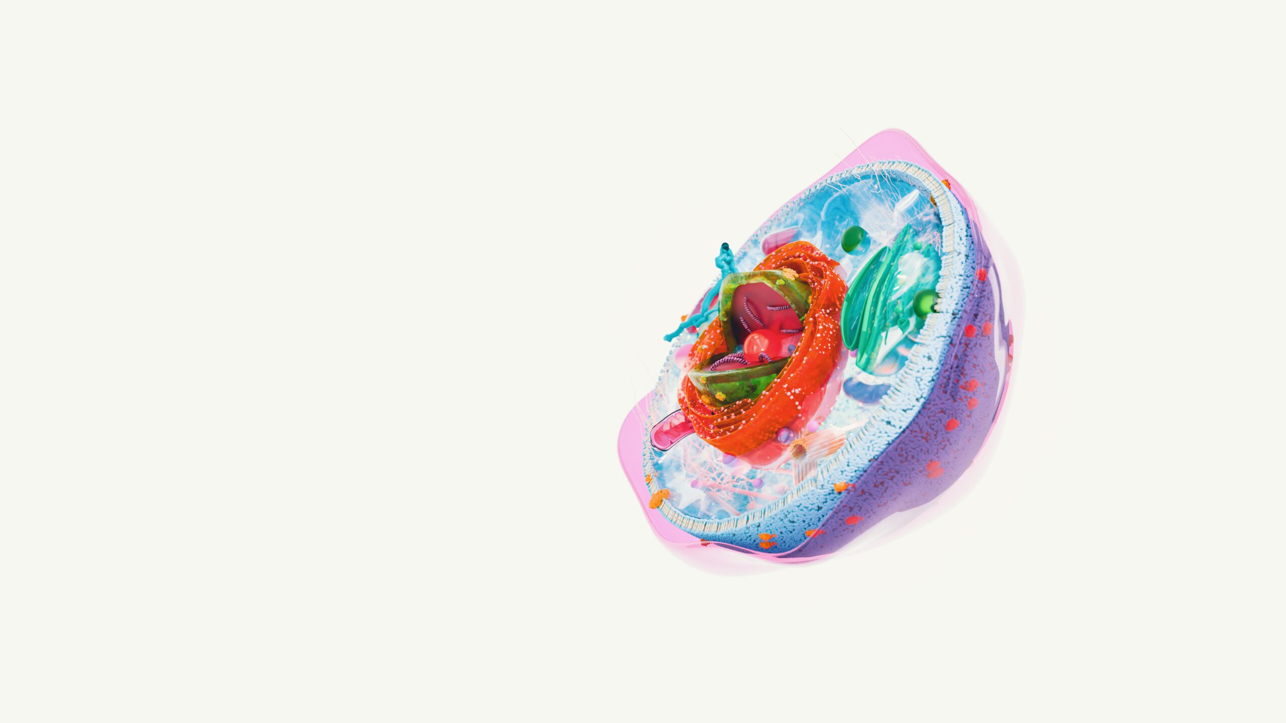
Blending scientific accuracy with artistic clarity
When people see molecular or cellular illustrations, they often assume they are looking at a stylized environment. The truth is: real molecular environments are incredibly dense, chaotic, and visually overwhelming.
As a scientific illustrator, my job is to strike a balance:
scientific truthfulness + visual clarity.
In this article, I’ll break down how I approach the creation of believable yet readable cellular and molecular worlds.
1. Start with density — then strategically simplify
Cells are not empty spaces. A single cell contains:
- millions of proteins
- microtubules
- lipid membranes
- organelles
- ongoing reactions
If I built everything at real density, the image would become a noisy blur.
So the trick is:
Model high density → selectively reveal what matters.
I keep:
- realistic membrane compositions
- correct protein shapes
- organelle proportions
But I simplify:
- small-scale noise
- excessive particle randomness
- background clutter
This keeps the visual biologically honest without overwhelming the viewer.
2. Use scientific references wherever possible
My main sources:
- RCSB Protein Data Bank
- TEM/SEM microscopy
- cryo-EM images
- histology slides
- reputable textbooks (Alberts, Lodish, Tortora)
- pharma white-papers
- scientific diagrams
Every element starts grounded in reality—even if I stylize it later.
3. Stylization with purpose
Scientific visualization is different from pure concept art. Every shape, line, and color has meaning.
Typical stylizations I use:
- smoother protein surfaces for readability
- enlarged receptors to clarify function
- exaggerated membrane curvature to help with silhouette
- color coding based on biological role
- stronger rim lighting for depth perception
Stylistic decisions always answer the question:
Does this help someone understand what they’re looking at?
4. Color language for biological storytelling
Color is a teaching tool.
Typical scheme I use:
- Teal / cyan → “background biology”, membranes
- Magenta / purple → DNA, RNA, nuclei
- Green → cytoplasm, neutral biology
- Warm colors (yellow, orange, red) → active sites, binding molecules, drug compounds
- Desaturated grays → structural components
Consistent color language helps viewers instantly identify biological roles.
5. Building materials & shaders
In Blender, I often create custom node setups to simulate:
- membrane translucency
- protein sub-surface scattering
- volumetric interiors
- refractive cytosol
- nanoparticle glow effects
Good shaders are what make a cell feel alive.
Translucency + soft volumetrics usually do the heavy lifting.
6. Accessibility: the silent rule
A good scientific illustration is inclusive.
I apply:
- color-blind-safe palettes
- strong silhouettes
- readable contrasts
- consistent visual metaphors
Clarity is the highest priority.
7. Examples of things I often include
- membrane texture with phospholipid waves
- ribosomes (stylized)
- vesicles and endosomes
- extracellular fibers
- receptor clusters
- actin filaments
- microtubule networks
- diffuse molecular clouds
These elements make the environment feel biological, not decorative.
Closing thoughts
Designing cellular environments is a delicate dance between scientific truth and artistic clarity. My approach is always the same: build reality, then highlight what matters most.
If you need custom cellular illustrations or 3D environments for research, pharma, or education, feel free to reach out — I’d be happy to help.
